Introduction
Know Your Data is a tool to help researchers, engineers, product teams and policy teams explore datasets, improve data quality and mitigate bias issues.
KYD aims to answer the following questions:
- Is my data corrupted? (e.g. broken images, garbled text, bad labels, etc).
- Is my data sensitive? (e.g. are there humans, explicit content).
- Does my data have gaps? (e.g. lack of daylight photos).
- Is my dataset balanced across various attributes?
UI Overview
The UI is organized in tabs.

The header shows the different tabs:
- Datasets – A list of all the datasets that are visualized by Know Your Data
- Stats – Global statistics of the features for a given dataset
- Item – Metadata associated with an individual item in the dataset
- Relations – Correlations between two different features
The header also shows the currently selected dataset name, as well as links on the right hand side to dataset information, feedback form, and this documentation.
The main panel (anything below the header) splits into two vertical sections:
- The left side shows the contents of the currently selected tab.
- The right side shows the Item Browser, an infinitely scrollable list of the currently selected items.
Datasets tab
The Datasets tab shows a list of all the datasets that are currently available in Know Your Data, along with a few sample thumbnails and the dataset size.
Stats tab
The Stats tab shows histograms of all the source features (also referred to as ground-truth features) in the dataset. In addition to those, Know Your Data also augments the dataset with derived features such as:
- Cloud Vision Label Detection
- Cloud Vision face detection
- Generic image properties such as brightness, sharpness, resolution, format, aspect ratio, etc
- EXIF metadata
The main goal of the Stats tab is to give a quick overview of the distribution of feature values and to allow the user to filter the data and explore subsets.
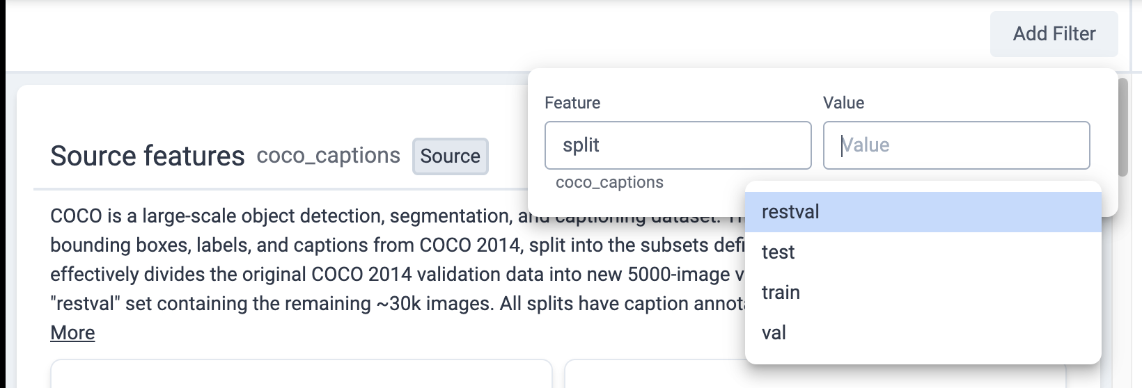
Clicking on a specific histogram bar applies a filter for that value on the dataset. When a filter is applied, all other histograms, as well as the Item Browser, react to that filter. Multiple filters can be chained together.
The same action can be achieved by clicking the “Add Filter” button.

Item browser
The Item Browser located on the right side is an infinitely scrollable list of item thumbnails.
The control bar located at the top of the item browser allows you to do various queries on the dataset.
Item tab
The Item tab shows all (source & derived) features associated with a specific item in the dataset. Clicking on a thumbnail in the item browser switches you to the Item tab and shows the metadata associated with that item.
Relations
In addition to browsing individual signals, KYD allows you to explore the
relation between two different signals. For example, we can measure the
correlation between
Cloud Vision Labels and
caption_words_gendered in the
Coco Captions
dataset.
There are two ways to open to the Relations table:
Each cell indicates either a positive (blue color) or negative (orange color) correlation between two specific signal values along with the strength of that correlation. The metric we use is inspired by the research of Aka et al., AIES '21 and is closely related to the PMI metric that tells us if two different feature values co-occur less or more than chance.
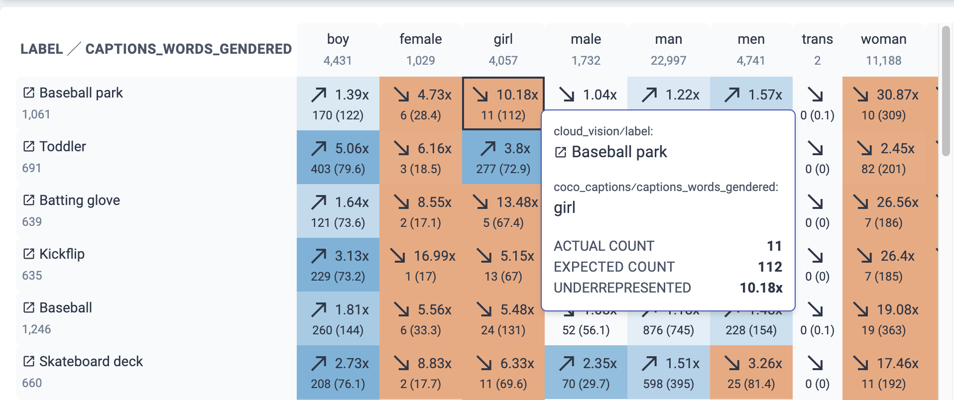
To explain the values in the table, let's hover over a specific cell:

Based on the color of this cell, we can see that this dataset lacks images with
the word girl in the caption and the label Baseball park from Cloud. In
particular, it shows:
- 1061 images with Baseball park (row counter).
- 4057 images with girl (column counter).
- 11 images with Baseball park & girl, but expected 112 by chance, which is 10.18X less than expected.
The expected count is computed based on the global counts of Baseball park and
girl assuming no correlation between those signals.
Sort Order & Searching
Since the table can have many rows (e.g. thousands for Cloud labels), the UI shows the first 100 rows and provides a search box at the top of the page to search for specific rows. The rows are automatically sorted by strongest correlation in any of its cells.
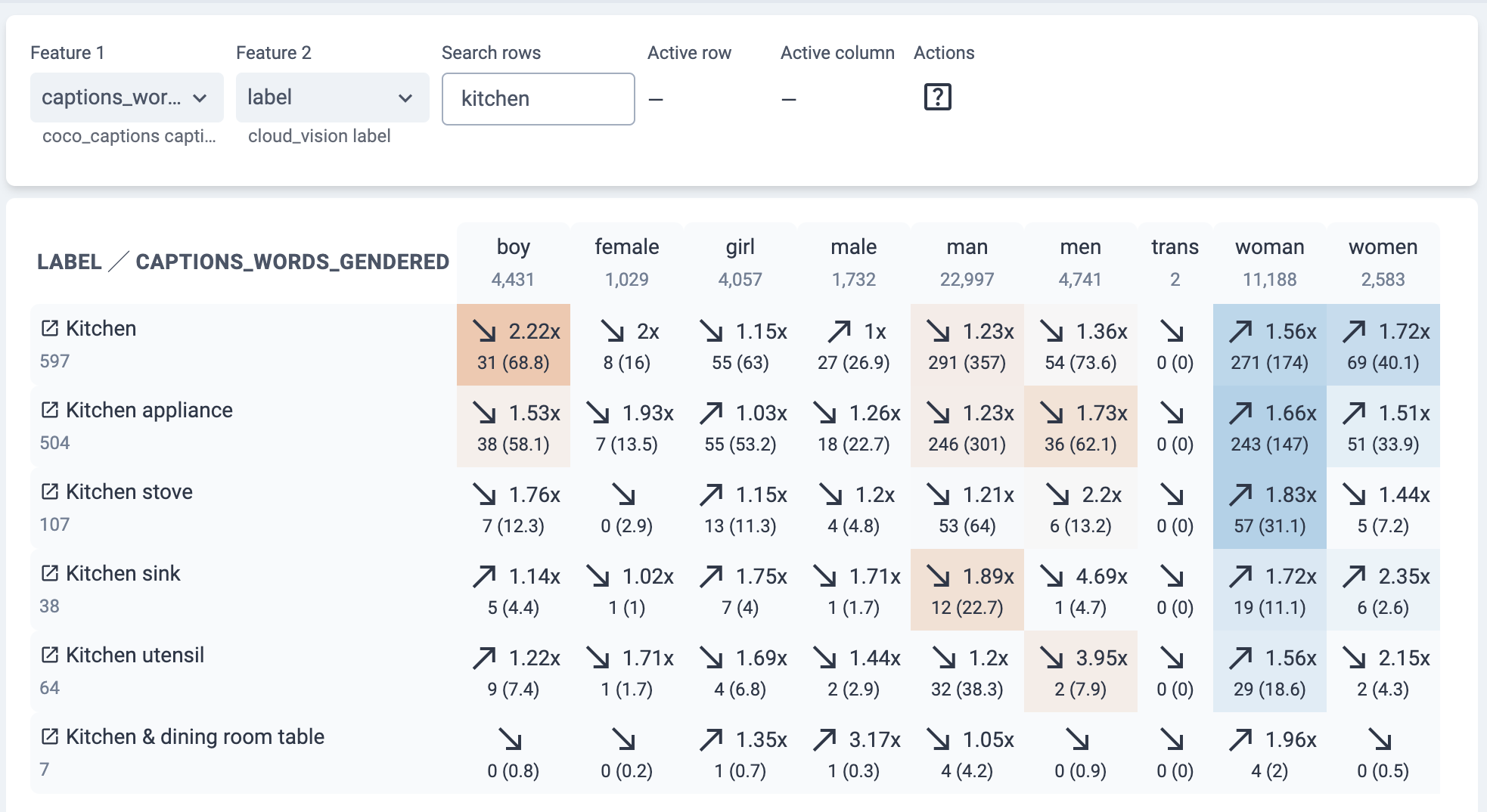
The search box is useful for testing a specific hypothesis. For example, we can
search for images with the Kitchen label, which shows overrepresentation with
the word woman and underrepresentation with the word man:

Interactive exploration
The Relations table is interactive. We can click on a row, a column, or a cell and immediately see the images behind the derived correlation. For example, we could click on the Kitchen row and see images that Cloud Vision labeled as Kitchen, while visually inspecting for any correlation with perceived gender. We can also click on the Kitchen & man cell to see images in that intersection:
Statistically significant correlations
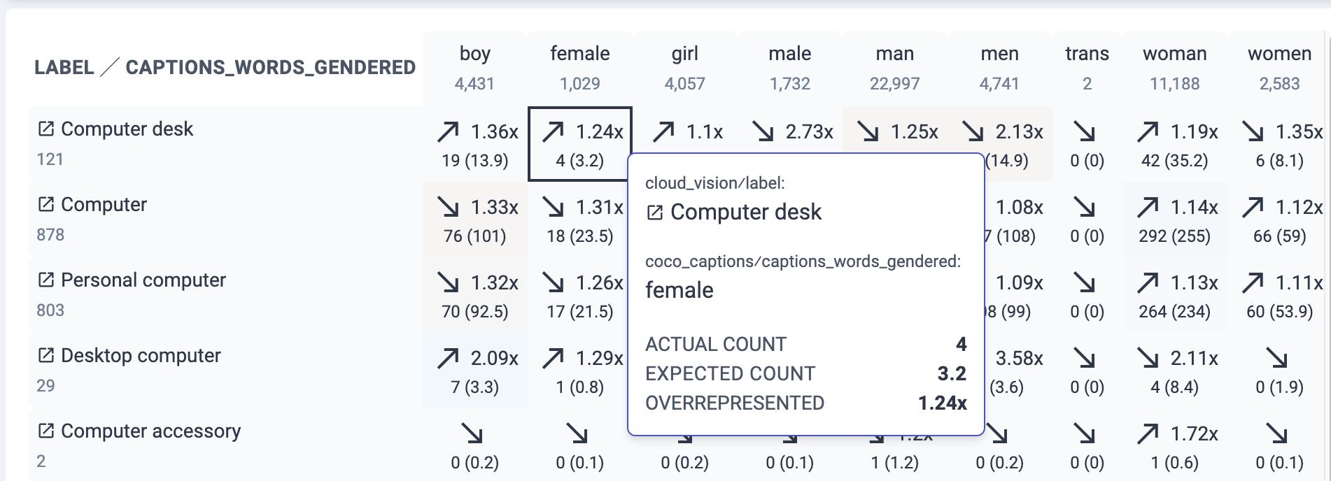
To avoid surfacing spurious correlations, KYD uses a 95% confidence interval and computes a conservatively adjusted correlation strength. We compute this by taking the upper or lower 95% bound of the expected count, whichever one results in a weaker correlation. The table does not show this number directly. Instead, the adjusted correlation strength is used to color the cell and to sort the rows. Therefore cells with strong correlations that are not statistically significant won't be colored strongly, and their rows won't be ranked highly in the table.
The example below showcases this where the Computer desk & female cell is not colored blue because there was only 4 observed images, and the correlation strength of 1.24x is not statistically significant:


